Sharable Data Visualizations: CharitySub.org
Below is a gallery of selected infographics that I designed for CharitySub.org, also showing the large array of causes that the organization served.
ROLE ON THIS PROJECT
Research, wireframes, data visualization, illustration, editorial content
As Cofounder/Creative Director for this little start-up I wore many hats over the three+ years of its existence. I was the principal designer on the project, responsible for researching the monthly topic and distilling data into a compelling story, then writing editorial, designing layouts and creating infographics to display on our site. (Read more about CharitySub.org)
PROJECT AND PROCESS
DISCOVERING HOW USERS INTERACT WITH OUR DATA
Interesting data visualizations were an important part of educating the CharitySub users about our monthly philanthropic causes. My role included research and design for intricate infographics that were displayed on the main page and refreshed every month. I tried to tell a story using bite-sized facts and illustrations that could be easily understood.
Over time, the format of these data visualizations evolved as we observed how users interacted with them. Initially, the design consisted of smaller illustrations scattered in between blocks of texts which were custom-made each month by our developer. Analytics showed that people were sharing our infographics on social media, driving extra traffic to our site. We also noticed that there was a correlation between the intricacy of the graphic and level of sharing that occurred. This data, coupled with changing business goals, led to a redesign of our main page to prominently feature a large graphic that could be shared as a stand-alone piece off the site. Read more about the app redesign here.
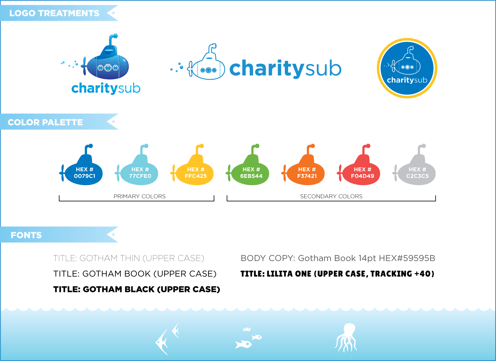
The graphics needed to reflect the company’s mission of making charity work accessible and approachable. The content was often upsetting or depressing, and it could be a real challenge to make the graphics jive with our ‘friendly’ approach to philanthropy. I created a style guide utilizing a bright clean palette consistent with our branding to lighten the mood.


